
Verb Products
Consumer Packaged Goods | Beauty Industry
Verb is a hair care brand made for people who want effective products at an affordable price point. They have a passion for saying what the product does and the product actually doing what it says.
Overview
Stepping into the color space was new territory for the Verb brand as it was previously specializing in shampoo and conditioners. Verb needed to establish themselves as a credible source for extending your hair color at an accessible price point in a very saturated market. The long term goal was to reach a new demographic of consumers who dye their hair and need constant refresh due to the costly process of hair bleaching.
![]()
︎︎︎ Final Packaging Design Direction
Overview
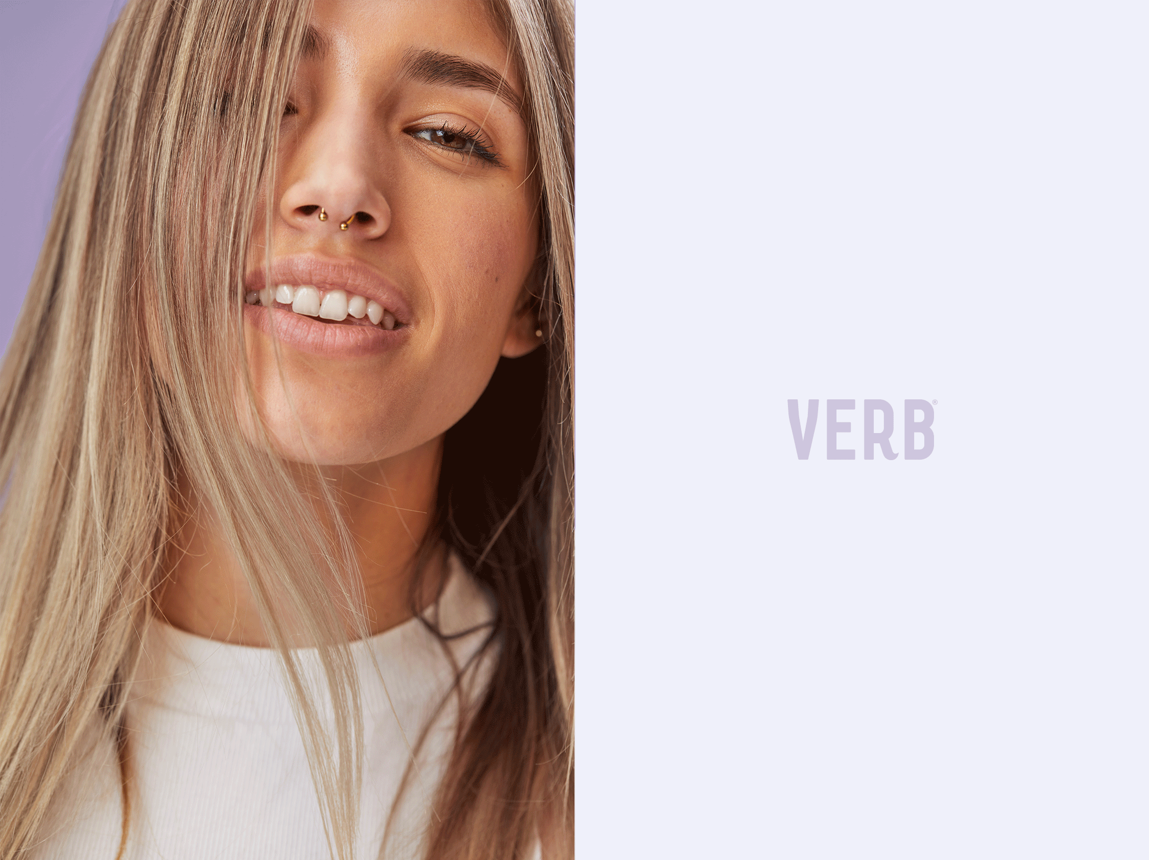
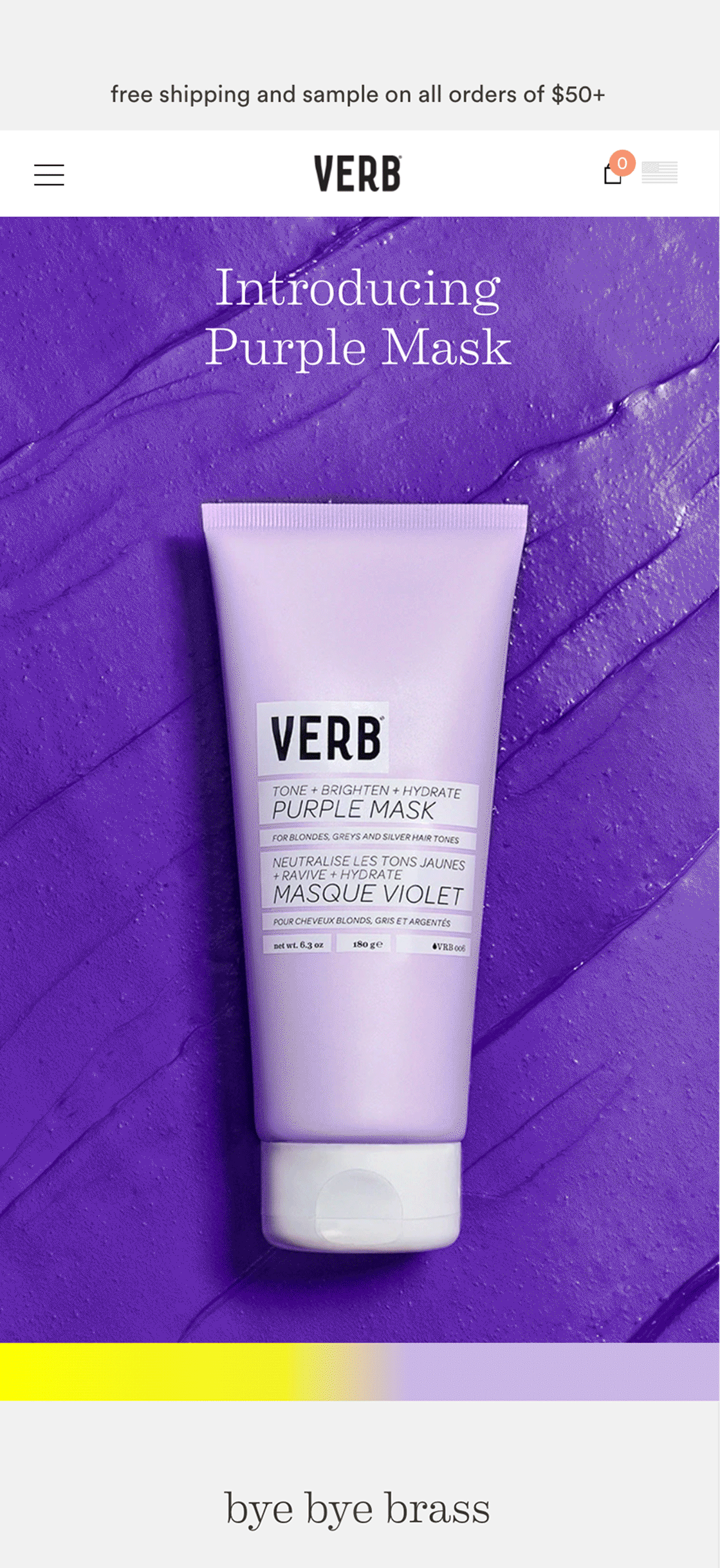
Through competitive analysis we were able to find a gap of underrepresented people who dye their hair but were not previously marketed to. Working alongside the social media team at Verb we casted people of different hair types who experienced brassiness in their blonde color treated hair. We also were able to have direct access to Professional Hairstylists who attended the model photoshoot to process the hair mask on the models, and become a model themselves. We wanted to focus on showing real people with real results. Throughout our work on this campaign we leaned into the color purple as a baseline for our creative. This allowed the blonde hair to contrast successfully to show the product efficacy. Additionally, the color purple was able to effectively stand out on a Sephora shelf vs. a white or natural bottle. To show the details of Verb’s Purple Mask we incorporated macro details for the formula and key ingredients. We wanted to impart a revealing aspect while marketing this product, and we were able to do that by displaying people with their brassy blonde hair (before) and with their toned hair after using the Verb Purple Mask.
![]() ︎︎︎ Diverse range of hair types being represented in our launch campaign.
︎︎︎ Diverse range of hair types being represented in our launch campaign.
![]()
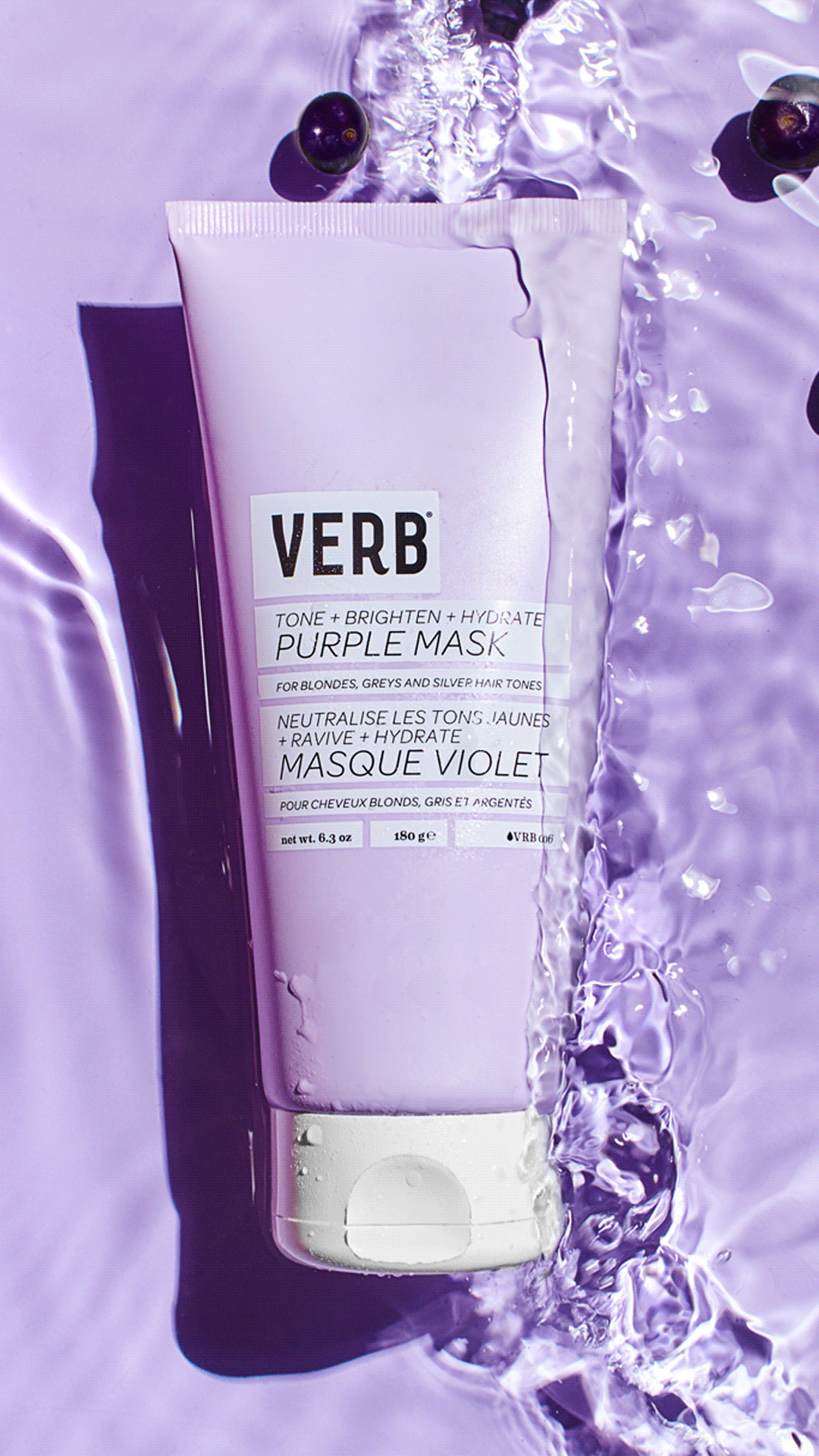
︎︎︎ Detail shots of Purple Mask with Acai Berries (key ingredient) with water to symbolize the fluidity of the product and tie it to the before and after movement of the model photography.
Verb is a hair care brand made for people who want effective products at an affordable price point. They have a passion for saying what the product does and the product actually doing what it says.
Purple Mask Launch
Overview
Stepping into the color space was new territory for the Verb brand as it was previously specializing in shampoo and conditioners. Verb needed to establish themselves as a credible source for extending your hair color at an accessible price point in a very saturated market. The long term goal was to reach a new demographic of consumers who dye their hair and need constant refresh due to the costly process of hair bleaching.

︎︎︎ Final Packaging Design Direction
Overview
Through competitive analysis we were able to find a gap of underrepresented people who dye their hair but were not previously marketed to. Working alongside the social media team at Verb we casted people of different hair types who experienced brassiness in their blonde color treated hair. We also were able to have direct access to Professional Hairstylists who attended the model photoshoot to process the hair mask on the models, and become a model themselves. We wanted to focus on showing real people with real results. Throughout our work on this campaign we leaned into the color purple as a baseline for our creative. This allowed the blonde hair to contrast successfully to show the product efficacy. Additionally, the color purple was able to effectively stand out on a Sephora shelf vs. a white or natural bottle. To show the details of Verb’s Purple Mask we incorporated macro details for the formula and key ingredients. We wanted to impart a revealing aspect while marketing this product, and we were able to do that by displaying people with their brassy blonde hair (before) and with their toned hair after using the Verb Purple Mask.
 ︎︎︎ Diverse range of hair types being represented in our launch campaign.
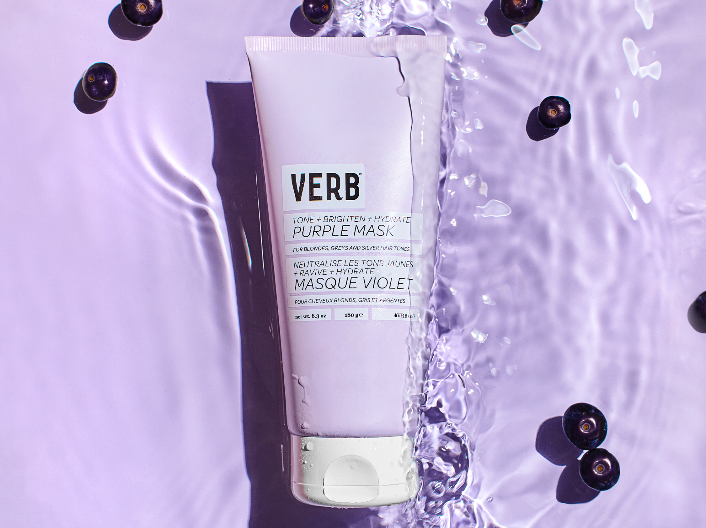
︎︎︎ Detail shots of Purple Mask with Acai Berries (key ingredient) with water to symbolize the fluidity of the product and tie it to the before and after movement of the model photography.
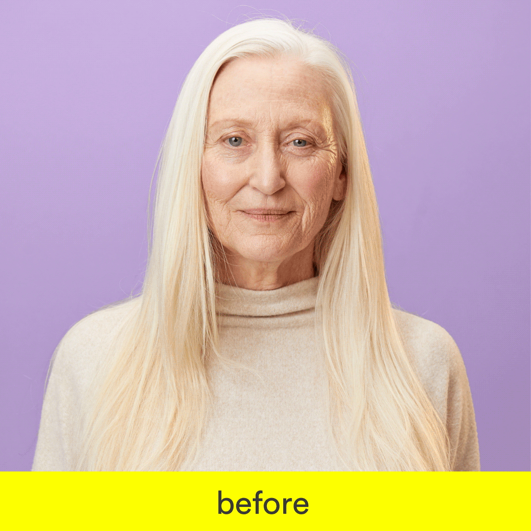
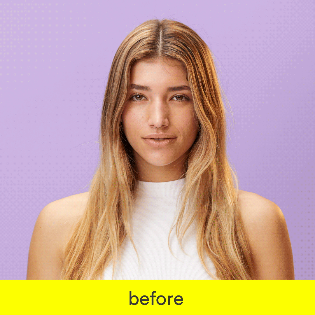
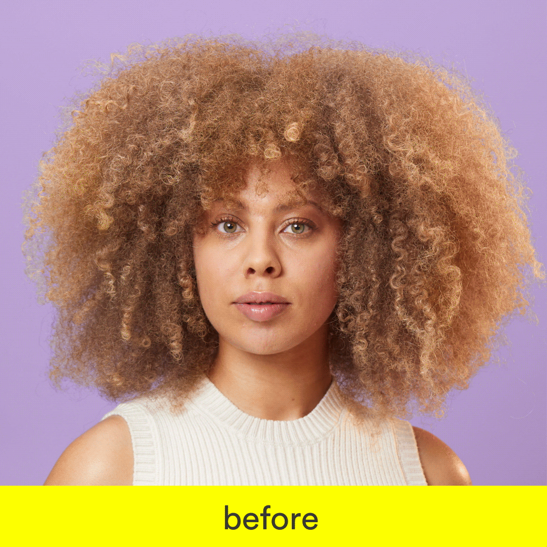
︎︎︎ Model Photography with reveling aspect as a main pillar of our launch, to show the effectiveness of the product at a glance.

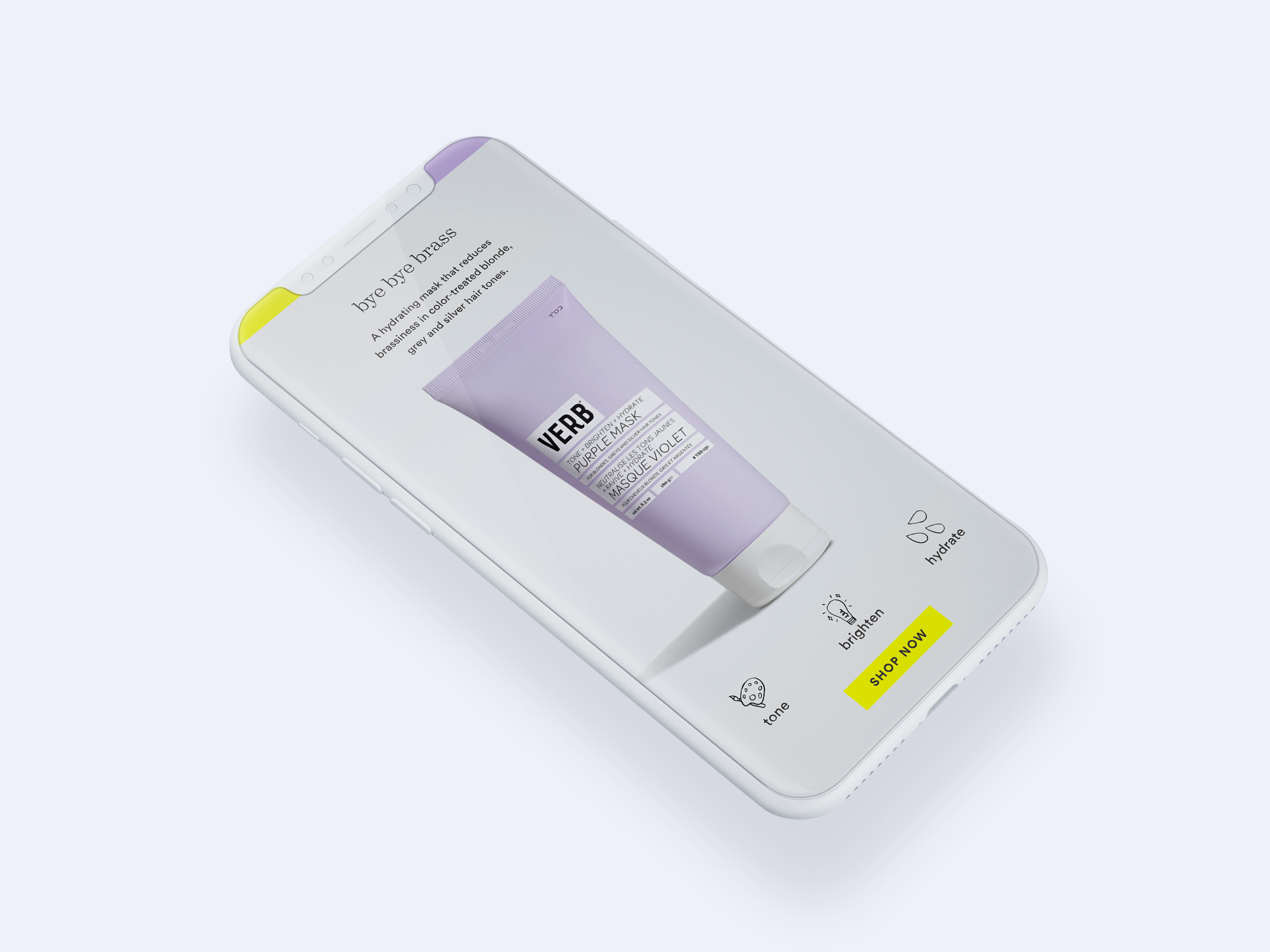
︎︎︎ Purple Mask landing page with a focus on mobile first. Creating a seamless experience for the consumer to recieve product education from Verb, as well as from professional stylists to increase credibility.
︎︎︎ Instagram & Facebook Paid Social
![]()
︎︎︎ E-mail Design
Outcome
Purple Mask was the most successful launch of Verb, increasing sales by 200%. It was the best selling hair color product for Sephora in Q2. Throughout the launch of the product we would continue to iterate based on our learnings. Ex. color contrast to grab attention, before and afters, replicating in-store experience digitally, professional.
Collaborators:
Art Direction & Design: Jessica Sedeno
Design: Perri Vaaler
Model Photography: Taleen D.
Product Photography: Samuel Bristow
Digital Marketing: Julianne Cornfield
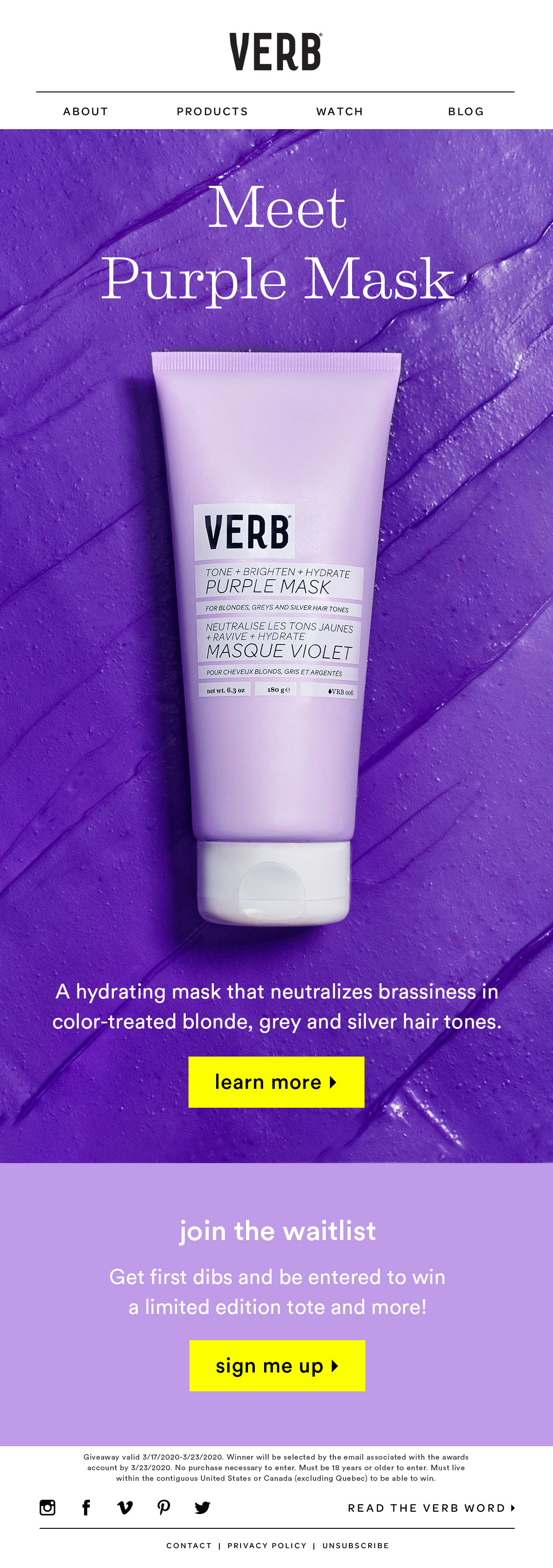